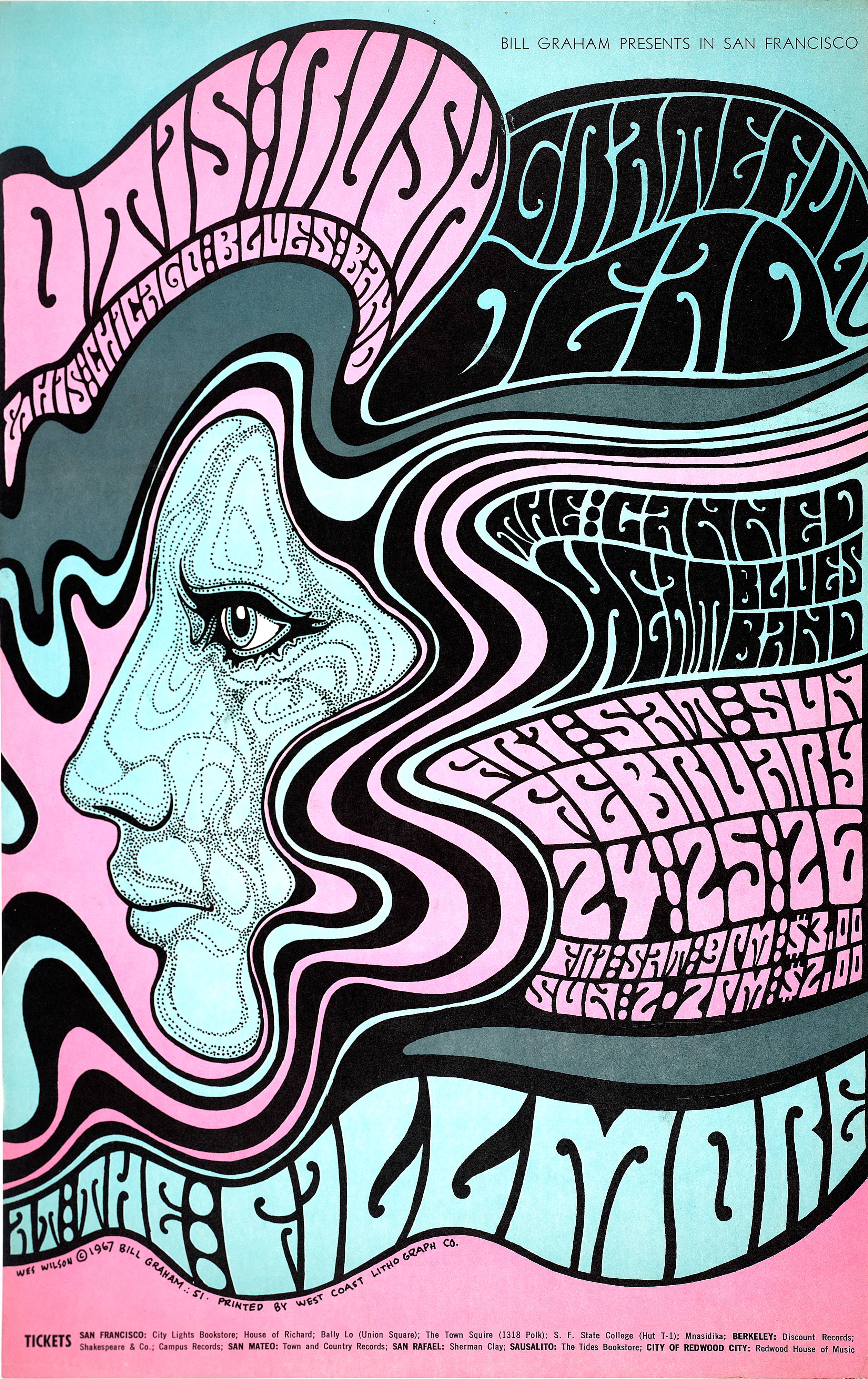
Much of the 60s and 70s music scene was influenced by the use of psychedellic drugs. The word psychedelic derives from the latin phrase ‘psyche’ meaning mind, and the greek term ‘delos’, which means to manifest, or awaken: ‘to awaken the mind’. The free flowing shapes and potent colours which infuse 60s and 70s typography reflect the freedom expressed in the period.
Balloon like lettering was greatly used, providing a symbol of hope during the socially tense 60s and 70s. This is heavily featured in the work of psychedelic artist Wes Wilson. Wilson’s concert poster designs came to define the 1960s psychedelic rock movement.
Wilson’s trademark style was born through influences from the Art Nouveau movement, Victorian and Edwardian typography as well as the French poster design of the late 1800s. Wilson maintained the stylised curves of traditional lettering whilst breaking the structure and shapes, allowing the letters to move freely.
To fill space, his work often involved wrapping words around fixed, free-flowing areas. This fluid block lettering style became synonymous with the 60s. The fonts used were predominantly heavily weighted, intended to be noticed. This was ideal for drawing in crowds for the concerts they promoted.
Wilson created iconic posters for artists such as Jefferson Airplane, Otis Rush, and the Grateful Dead. In this poster for an Otis Rush concert, almost every available space is occupied by free moving Art Nouveau inspired lines, bold colours and lettering influenced by 19th century graphic designer Alfred Roller.

Initially the poster was rejected due to its barely legible lettering to which Wilson responded, ”They’ll stop to read it because they can’t read it.” The unrestrained typography used in Wilson’s, and other psychedelic designers’, posters does not damage the appeal of the overall design as the words are often morphed and arranged to form a larger image, demonstrated in the Otis Rush poster. It’s these shapes and vivid colours which animate the imagery and typography, making the posters marketable.
However, some of Wilson’s posters utilise more legible fonts. In his poster for the Byrds’ first concert, Wilson has used a more structured design.
![Wes Wilson [Untitled] (The Byrds) 1966 Wes Wilson [Untitled] (The Byrds), 1966](/uploads/byrds.jpg)
Taking inspiration from Alfred Roller once more, Wilson’s lettering occupies all the available space on the poster. The ‘Byrds’ lettering has a three-dimensional look and the counters more open, as a result, increasing legibility and allowing the ‘main attraction’ to be easily read without struggling to decipher what’s being said.
This style of typography, although adapted in the 60s, found its roots in the 1890s. It’s timelessly modern feel only proves the lasting power and impact of this type of advertising and the continued popularity of its style.
