The digital age of streaming has made album cover design almost obsolete. Rather than occupying a 12 inch by 12 inch vinyl sleeve, which could be pulled from a shelf and admired in all its glory, albums are shrinking to screen size, scrolled past in seconds. Their aim is not to be admired like before but instead to quickly grab the attention of the listener.
Presenting the artist as a brand and appealing to their fan base has become more significant than ever before. The album cover is now one of many branding tools whereas before, it was one of the only forms of promotion in the music industry. In previous eras it was frequently the first glimpse of what a band’s next step looked like. However streaming services have ushered in a new reality; music no longer depends on the full cohesive album the way the eras of vinyl, CDs and cassettes did. These days, it’s not always the album cover announcing the branding for an artist’s album.
As opposed to detailed imagery and fanciful typography, the best modern covers feature clean and simple graphics. An example of a digital friendly cover is Drake’s If You’re Reading This, It’s Too Late (2015).

The black handwritten letters form a stark contrast with the blank background. Due to its simplicity, the album cover can easily be translated into other forms of branding such as t shirts and promotional posters. The handwritten style typeface provides a level of familiarity, bridging the gap between Drake and his fans.
The album evoked an instant reaction from viewers, quickly becoming a meme — it was used as a template for jokes, creating interest - helping to promote the album through their satire. Due to its direct and notable style, it can be copied endlessly without distorting the original design.
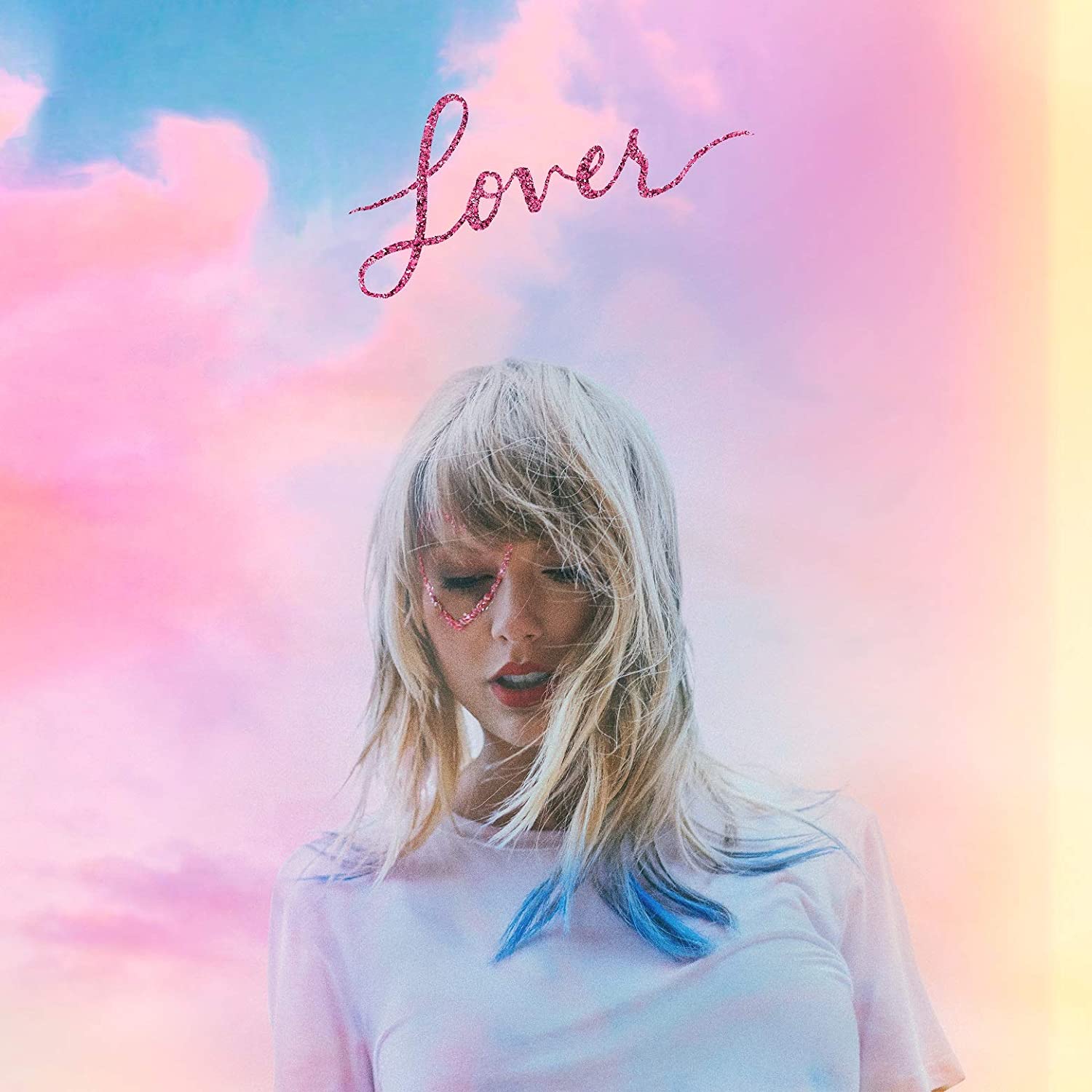
This emphasis on engaging fans by using album cover design, can also be viewed in Taylor Swift’s 2019 album ‘Lover’. The cover artwork has a fan made appearance. Similarly to Drake, the font is handwritten, pushing the personal feel Swift wanted her album to give. The simplicity of Swift’s ‘Lover’ cover means that it can be easily edited by fans. After its release, people began photoshopping themselves onto the album, forming a sense of community in the fanbase and relatability to the artist.

The pastel colour scheme of the cover is gentle and reassuring, appealing to the bubblegum pop sound of the album. The cover art takes inspiration from the ‘pastel wave’ of Tumblr fan edits which emerged in the 2010s, reinforcing the relatable feel and allowing fans to feel closer to Swift.
New technology has made it easier than ever before for everyone to explore design, encouraged by social media to fit into a square mould. It is only the most outrageously remarkable or subtly clever cover designers who are able to push the boundaries to become prevalent in our instant world today.
